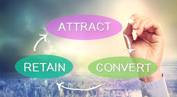
 No matter what kind of business you’re in, conversions are king. The bottom line of any business is making money, and the root of that money is how well your product or service converts.
Even if you’re just in the business of advertising affiliate products, you can work on your own conversions in your email marketing, your videos, your reports, or any other marketing materials you use.
There are a lot of simple ways to improve conversions, and there are a few more advanced methods that we’ll take a look at later. For now, we’re just going to examine a few things you can easily change for quick results.
Easy Conversion Boosters
Headline or Subject
Your headline is the most important element of any marketing piece. If you have a sales page or landing page, you’ll have a standard headline. If you’re doing email marketing, your headline is your email subject. In video marketing, it’s your video title or the opening intro.
Your headline is the first thing people see or hear from you, so it needs to be compelling, powerful, and exciting. Too many people make the mistake of creating what they think is a great headline, but just because they think they would respond a certain way doesn’t mean the average visitor would.
Aside from your headline, the call-to-action is one of the easiest changes you can make, and also one of the most powerful. Your call-to-action is where you actually tell visitors what action you want them to take next. If you don’t have a call-to-action, you need to get one!
Let’s say you have a landing page where you’re trying to get people to opt in to your email list. You call-to-action might say something like:
“Enter your name and email address in the box below and we’ll send you this free report immediately!”
That might convert extremely well, but you could also test variations such as:
“Ready to get your free copy of this amazing report? Just enter your name and email below”
“Enter your name and email address below and we’ll rush you a free copy of this revealing report to your inbox in minutes!”
Each variation is similar to the original, but shifts focus slightly with minor changes. Remember, minor changes can sometimes equal big conversion boosts!
Contact Information
Believe it or not, but something as simple as including contact information on your website can improve conversions… sometimes to a massive degree.
You see, so many people have been scammed online by companies they had no way to contact that they have become wary of such things. It’s comforting when you display your contact information prominently, because they at least have the sense of security that comes from knowing they can get in touch with you if there’s a problem.
Not only that, but if you include a phone number and/or address, you’ll go a long way toward convincing visitors that you’re a “real” company.
Most sales pages these days have guarantees, but did you know you can also use guarantees in other ways? For example, if you are an affiliate, you can offer your own guarantee by telling people if they buy and don’t like the product, they can not only get a refund through the company’s guarantee but that you’ll give them some kind of bonus of your own.
This could be a free report, access to a membership site you own, a few bucks out of your own pocket, etc. Most people will never collect on this, anyway. But be sure you can deliver what you promise just in case someone actually does.
Also, keep in mind that longer guarantees can improve conversions significantly. A 90-day guarantee is much more powerful than a 30-day guarantee.
Hold on, don’t panic! Studies have shown that longer guarantees actually lessen refunds, because most people end up forgetting about the guarantee after such a long time period, and if they do remember, it’s usually too late to claim it.
Plus, a 90-day guarantee helps minimize chargebacks, too, because many credit card companies won’t allow chargebacks after 90 days.
Credibility
One very simple way to give conversions a quick boost is to improve your credibility rating by using those “trust” seals you see on some websites. You can get these from places like the Better Business Bureau and Verisign. Believe it or not, these simple seals actually do help people trust you, and can definitely improve conversions.
Design
Colors and fonts and other design elements can have a big impact on conversions, and the fact is, the “obvious” design choice isn’t always going to convert best.
Most sales pages for golf products use the color green because of the green color of the grass on a golf course, but did you ever wonder if that color actually helps sales? It may. Then again, it may not.
Sometimes the “obvious” choice could actually hurt sales. For example, you might choose red for a product geared to help women with their romantic lives, but psychologically red doesn’t only signify romance, it also signifies power. It could potentially have the psychological reaction of making women fearful if they’ve had controlling, power-hungry men in their past. Then again, red might work.
That’s another reason why it’s important to test various things to see what works.
Also, keep in mind that beautiful designs may boost your ego and make you feel proud to own your site, but they don’t always help conversions. Sometimes the simplest, ugliest designs can convert much, much better than something “pretty”.
Stay tuned for Part 2 – Advance Conversion Boosters


